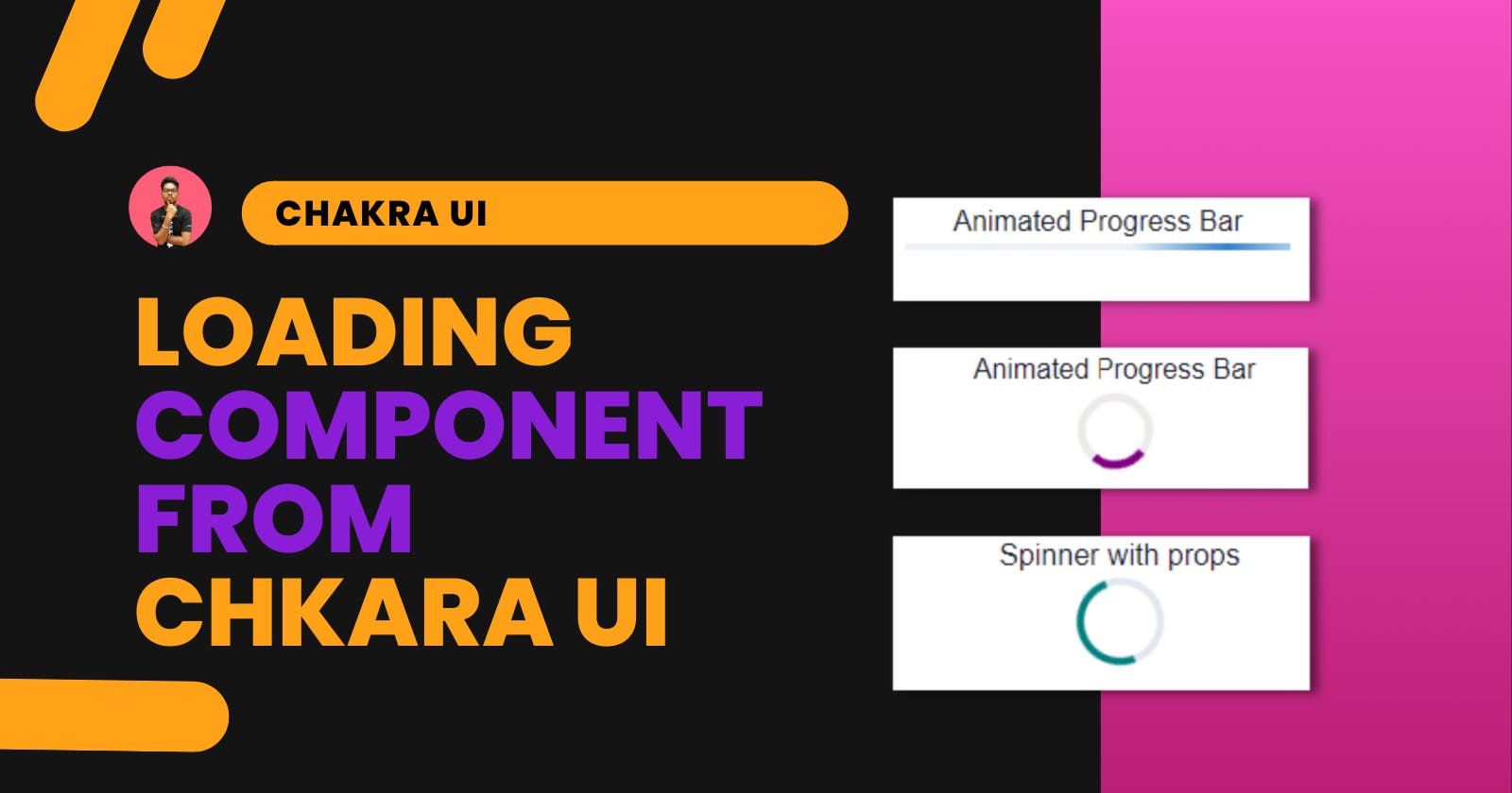

Introduction
There are various components in a modern website. We try to implement those that are necessary and often forget some components. This component is necessary for accessibility. Loaders are that component. Loaders will let tell the user that some processing is going on. In this way, they don't feel like changing the web page if nothing is shown.
We are going to implement different loaders in a React application. This loaders component is provided by Chakra UI. It generates things to include for this article for the React-based framework. It is the best library for having UI components. You can easily customize it according to your theme.
In this article, we are going to implement the following loaders:
Progress bar
Circular Progress
Spinner
Skeleton Loading
Installing Chakra UI to React
If you initialize the project, then you can use a code template for installing React with Chakra UI.
Here is the command:
npx create-react-app my-app --template @chakra-ui
For manual installation to an existing React project, you can run the below command.
npm i @chakra-ui/react @emotion/react @emotion/styled framer-motion
In this method, we also need to set up the ChakraProvider at the top of our app.
In the index.js file add the following code:
import * as React from 'react'

// 1. import `ChakraProvider` component
import { ChakraProvider } from '@chakra-ui/react'

function App() {
  // 2. Wrap ChakraProvider at the root of your app
  return (
    <ChakraProvider>
      <App />
    </ChakraProvider>
  )
}
Now, let's add a loader to the application.
Progress bar
For the prgoress bar, we have a Progress component from Chakra UI. You can import it with the below code.
import { Progress } from "@chakra-ui/react";
Use the component as:
<Progress value={10} />
The value denotes the loading percentage. You can use a state to change as per loading. Also, you can create an Animated progress bar that will not require any value. It will be just loading again and again.
Here is the code:
<Progress size='xs' isIndeterminate />
You can take a look at the examples here:
{% codesandbox chakra-ui-progress-bar-chmvk7 %}
Circular Progress
Circular progress is the same as the progress bar but in the circle. You can import the CircluarProgress from the Chakra UI library.
Use the component as:
<CircularProgress value={80} />
This will produce the circular progress with the loaded percentage as 80. You can add a text denoting the loaded value inside the circle with CircularProgressLabel component.
Use the component as:
<CircularProgress value={40}>
  <CircularProgressLabel>40%</CircularProgressLabel>
</CircularProgress>
You can create an infinite loading circle with the props isIndeterminate inside the component. It is the same as the progress bar.
Use the component as:
<CircularProgress color="purple" isIndeterminate />
Note: You can give different colors to the loaders with
colorprops.
You can take a look at the examples here:
{% codesandbox chakra-ui-circular-progess-m0lz0l %}
Spinner
The spinner is quite the same as an infinite circular loading screen. The only change is the animation. In the spinner, it is constant.
Use the component as:
<Spinner />
You can give different props such as thickness, speed, color, and empty color.
<Spinner
  thickness='4px'
  speed='0.65s'
  emptyColor='gray.200'
  color='teal'
  size="xl"
/>
Speed is the time to complete one circular animation. It takes in as seconds unit. emptyColor is the color of the empty area while color is the loading spinner color.
Note: You can give
sizeprop to any loader to adjust the size of the component.
You can take a look at the examples here:
{% codesandbox chkara-ui-spinner-y8btlr %}
Skeleton Loading
The most interesting loading component is this one. It is now being used by most modern websites. There are three components for skeleton loading:
Skeleton: It is for loading a div that takes some space on the webpage.
SkeletonCircle: It is for loading a circle object.
SkeletonText: It is for text loading.
You can import all from the library.
Skelton
For the skeleton, we just need to provide the height props for the height of the div.
Use the component as:
<Skeleton height="100px" />
SkeletonCircle
It is the same as the Skeleton but the div is the circle. You can adjust the size of the circle with size props.
Use the component as:
<SkeletonCircle size="50" />
SkeletonText
Add the SkeletonText for loading the text. You can add the number of lines and skeleton height.
Use the component as:
<SkeletonText noOfLines={4} skeletonHeight='2' />
You can take a look at the examples here:
{% codesandbox chakra-ui-skeleton-38ecp3 %}
Conclusion
We have taken a look at different loading components that are provided by Chakra UI. This loading component will be enough for any website to implement a loading screen. I use Chakra UI for building my components. It is quite easy to install and use. Along with the loading screen, I will also recommend you look into other components of Chakara UI.
I hope the article has helped you in understanding the different loading screens of Chakra UI. Thanks for reading the article.